


CAMP has a new image: stronger, contemporary and closer
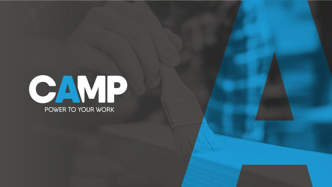
Camp changes image but not identity. The company started a transformation project that involved the brand, products and communication tools.
The journey began with a strategic choice: eliminating the three brand lines - Professional, Surface Care and Home Care - and bringing together all the products under the historic brand, which has been redesigned to make it more contemporary.
The next step was the definition of a new payoff: Power to your work.
The payoff is aimed directly at users, to communicate closeness and availability. The direct tone and decisive language tell of a company that is sure of its products and its quality.
Catalogue and products
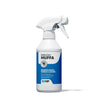
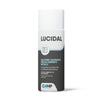
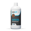
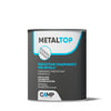
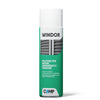
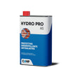
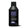
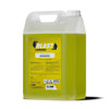
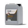
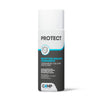
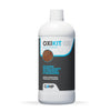
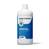
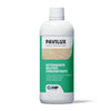
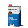
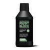
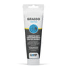
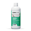
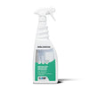
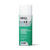
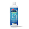
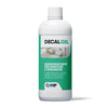
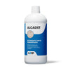
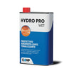
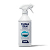
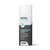
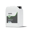
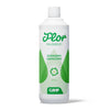
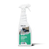
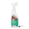
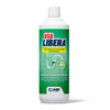
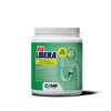
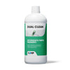
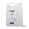
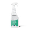
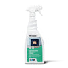
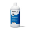
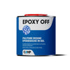
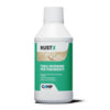
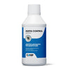
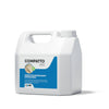
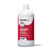
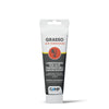
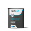
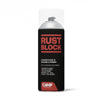
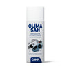
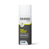
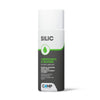
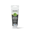
After redesigning the brand, we moved on to the products. The first phase was the reorganization of the catalogue. After a long study, six new ranges have been created (Industry and DIY, Construction, Thermo-hydraulics, Automotive, Home and Sanitizers) to help customers better orient themselves in the offer.
The next phase was the redesign of the over 180 labels, to enhance the products and ensure strong differentiation on the shelf. Once the labels were defined, the new catalog was designed, so as to offer a complete overview of Camp services and solutions.
Communication
The change process also affected digital and social communication tools, with a new web portal, new social channels and new paid ad campaigns.
On the site everything is at hand, with clear and easy-to-consult information. Navigation is fluid and comfortable, the products are always in the foreground and a news section offers advice and tutorials.
Evolution has just begun. Camp doesn't stop.